
Why Mobile-Friendly Website Matter More in 2026
In 2026, the people use the internet has changed more than ever before. Smartphones are now a part of every moment—whether someone is shopping, learning, scrolling social media, watching content, or searching for a service. Today, if your website doesn’t work smoothly on a mobile phone, users will close it in seconds and move on to a competitor that loads faster and looks cleaner.
Mobile-friendly design is no longer a “good to have” feature. It has become a business necessity. Whether you run an e-commerce store, a local shop, a service business, or a professional brand, your website must give mobile users a smooth, fast, and enjoyable experience. In this blog, you will understand why mobile-friendly websites matter more in 2026 and how they directly influence your SEO, traffic, conversions, brand trust, and overall digital growth.
1. User Behaviour Has Completely Shifted in 2026
The biggest reason mobile-friendly websites matter today is simple: people prefer smartphones over desktops for almost everything.
Think about it:
- People scroll on their phones all day
- They shop directly from mobile apps and sites
- They read blogs, watch videos, and search for information on mobile
- Payments, bookings, and inquiries happen through mobile
users don’t even open laptops they have office work. This shift in user behaviour means that when someone visits your website, they are most likely on a mobile device.
now days people also make faster decisions. Their attention span is short. If your website takes too long to load or looks messy on a smaller screen, they will move away instantly. Modern customers judge your brand’s professionalism based on your mobile experience.
This is why a mobile-friendly design is no longer optional—it’s directly connected to user trust and brand perception.
2. Google’s Mobile-First Indexing Changed Website
Google has made one thing very clear:
Your mobile website determines your ranking—not your desktop site.
This is called Mobile-First Indexing.
In simple words:
- If your mobile site is fast, clean, and responsive → you rank higher on Google.
- If your mobile site is slow, broken, or hard to navigate → your rankings drop.
Google mainly checks three things through Core Web Vitals:
- LCP (Largest Contentful Paint) – How fast your main content loads
- INP (Interaction to Next Paint) – How quickly your site reacts
- CLS (Cumulative Layout Shift) – How stable the layout loading
If your mobile website fails these metrics, Google reduces your visibility.
This means fewer visitors, fewer leads, fewer sales.
In 2026, businesses must build websites with a mobile-first approach, not desktop-first. Your website must be designed, tested, and optimized primarily for phone screens.
3. Speed Matters: Every Second = Money
You may have the most beautiful website in the world if it loads slowly on mobile, users won’t stay long enough to see it.

A one-second delay can drop your conversions by 7% to 10%.
Reasons mobile websites become slow:
- Heavy images
- Unnecessary animations
- Too many plugins
- Poor hosting
- Large JavaScript files
- No caching
If mobile site delay a little, users leave because they expect instant results. In 2026, people are not patient. They want everything fast.
A fast mobile-friendly site improves:
- Sales
- Leads
- Page views
- User trust
- Google rankings
Speed is officially a ranking factor, and it directly affects business growth.
4. Mobile-Friendly Website Boost Sales & Conversions

A mobile-optimized site doesn’t just look good—it makes people take action.
Here’s how mobile-friendly design increases conversions:
- Bigger, thumb-friendly buttons make it easy to click
- Simple navigation helps users find what they want quickly
- Quick checkout improves e-commerce sales
- Click-to-call buttons directly increase leads
- Fast loading speed keeps users engaged
- Clean design builds trust
Imagine a user trying to buy something or fill a form. The text is too small, buttons are unclickable, or the page keeps moving. They will drop the idea instantly.
A mobile-friendly website gives the user confidence that your brand is reliable and professional.
5. Local SEO Depends on Mobile-Friendliness in 2026
Local businesses depend heavily on mobile searches.
Think about how you search:
- “Salon near me”
- “Restaurant nearby”
- “Electrician in my area”
70% of these searches are done on mobile phones.
Google shows mobile-optimized websites higher in local results they offer better user experience.
A mobile-friendly site supports:
- Google Business Profile ranking
- “Near Me” search visibility
- More calls
- Many map visits
- More store walk-ins
If your local business website works poorly on mobile, you are losing customers every single day.
6. The Mobile Shopping Boom of 2026

Online shopping through smartphones has exploded.
UPI payments, one-tap checkouts, fast deliveries, and mobile wallets have made the process extremely simple.
People prefer buying mobile:
- It’s faster
- They can shop anytime
- Checkout is easy
- Cards and wallets are already saved
- Websites are optimized for mobile buying
If your eCommerce store isn’t optimized for mobile users, you’re missing the biggest share of today’s online buyers.
Mobile-first commerce is not the future—it is already the present.
7. Voice Search Is Now a Major Part of Mobile Behaviour
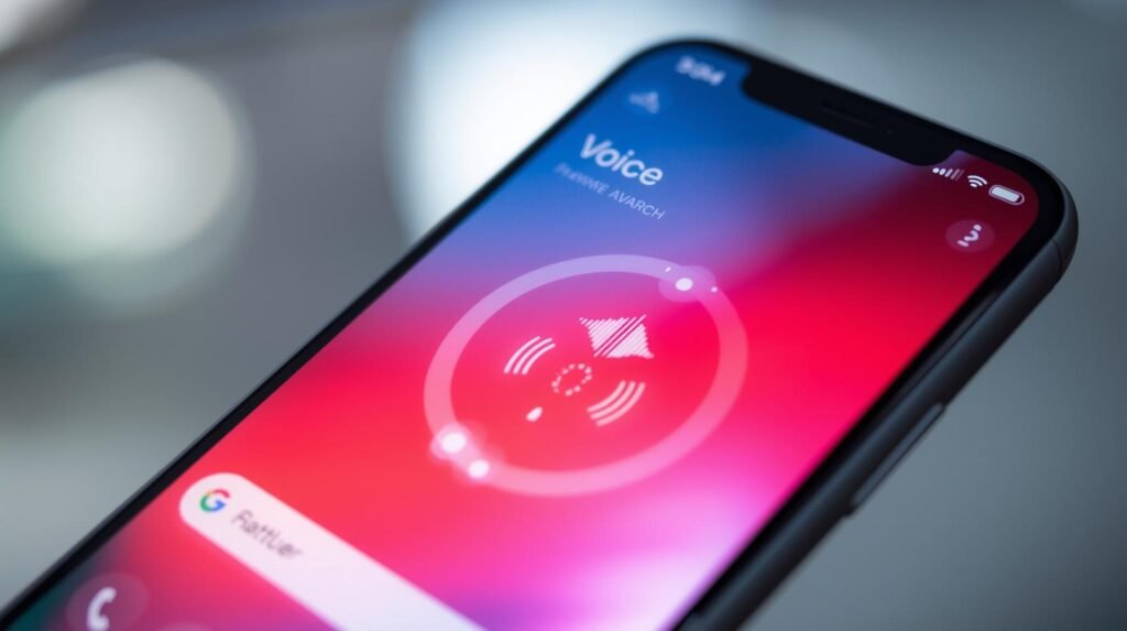
People increasingly use voice search on mobile:
- “Best cake shop near me”
- “Affordable laptop under 50,000”
- “How to apply for passport online”
Voice search queries are longer, more conversational, and more natural.
To be voice-search optimized, your website must:
- Load fast
- Have clear headings
- Use natural language keywords
- Be mobile-friendly
Voice search is growing every year, and mobile-focused websites benefit the most from it.
8. Mobile Design Trends Dominating 2026
Web design has transformed drastically.
Here are trends shaping mobile web experience in 2026:
1. AI-Based Personalized Experience
Websites automatically adjust based on user behaviour, preferences, and interaction history.
2. Gesture-Based Navigation
Swipe, drag, and tap movements make browsing fun and natural.
3. Dark Mode Optimization
Many users prefer dark mode, and websites are adapting to it.
4. Lightweight UI Design
Simple, clean, and fast-loading designs win.
5. Mobile-Based Augmented Reality (AR)
Try-ons, previews, 3D demos are becoming common.
These trends clearly show that mobile is not just a smaller screen—it’s becoming a smarter, interactive platform.
9. How to Make Your Website Truly Mobile-Friendly
Here are practical steps to ensure your website is perfectly mobile-friendly in 2026:
Responsive design
Your site should automatically adjust to all screen sizes.
Use thumb-friendly buttons
Make sure all buttons are large enough and spaced properly.
Keep the UI clean and minimal
Avoid clutter, unnecessary animations, or long layouts.
Reduce image sizes
Compress your images for faster loading.
Avoid heavy pop-ups
Mobile users hate interruptions.
Use quality hosting
A good server improves mobile experience.
Test with Google’s Mobile-Friendly Test
Fix any issues Google highlights.
Use lightweight WordPress themes or builders
Avoid heavy themes. Astra, GeneratePress, or Oxygen are ideal.
Enable caching & compression
To make pages load instantly.
This steps will dramatically improve your website’s mobile performance and user satisfaction.
10. Final Thoughts: Mobile-Friendly Is Not a Choice—It’s the Key to Growth in 2026
In 2026, mobile-friendly websites are not optional. They are the foundation of digital success. Everything—from SEO and traffic to conversions and customer trust—depends on how your website performs on a smartphone.
Businesses that ignore mobile optimization will lose customers, rankings, sales, and brand value.
Those who invest in a fast, responsive, mobile-focused website will see massive growth in reach, revenue, and online credibility.
Your website is your first impression.
Make sure it looks and performs its best on the device people use the most—their mobile phone.